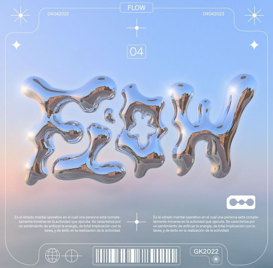
Why does this image above look like it’s from the future?
In the communication arts, some images naturally suggest the future. Take the image above, with its metallic curves that seem to break all the usual rules. Why do we see it as futuristic? This speculation dives into that question, exploring how balloon or liquid-like metal shapes make us think of high-tech and innovation, and uncovering how contemporary visual culture continues to redefine our notions of time, progress, and possibility.
Let’s take a trip back in time to see how our fascination with metal has evolved. Think about it this way: back in the Bronze Age and Iron Age, whenever we figured out how to mess with metal, society took a huge leap forward—it was like going from black-and-white TV to high-definition. Today, we’re still showing off what we can do with metal, but now it’s less about swords and more about playing around with its forms in ways that catch the eye. Take Frank Gehry’s Guggenheim Museum in Bilbao. It’s like he went wild with a giant piece of shiny tin foil and turned it into this epic, twisty metal sculpture that you can actually walk into.
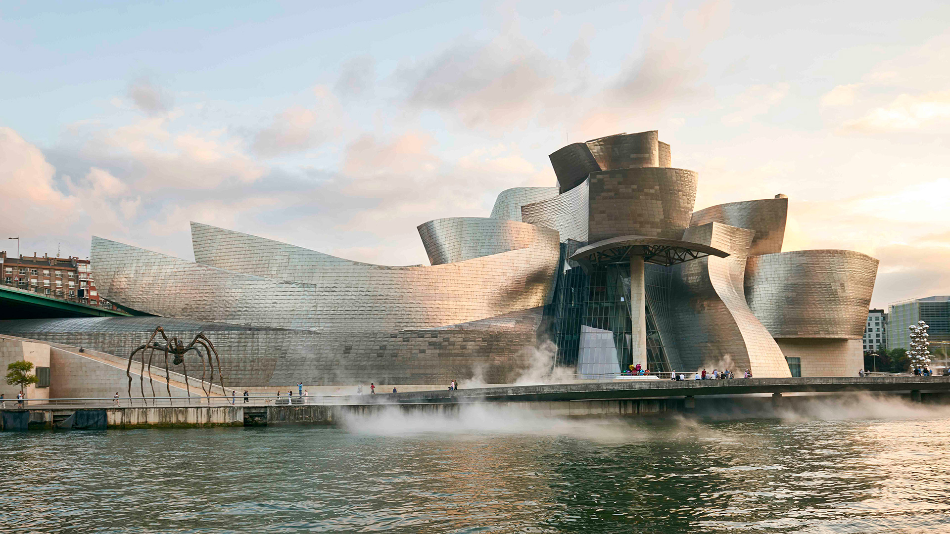
But how does this relate to our image? This image with metallic type is doing something similar but with a 21st-century twist—thanks to CGI, we’re not just bending metal; we’re virtually liquifying it. It’s a bit like that moment in “The Matrix” when the kid says, “There is no spoon.” It makes you rethink what’s real and what’s possible. Just when you thought metal couldn’t get any cooler, here it is getting all futuristic on you, morphing in ways that defy old school physics. It’s a slick nod to how we’ve gone from hammering out basic tools to manipulating metal into fluid, mind-bending shapes that make you think, “Wow, that’s pretty rad.”
Now, let’s zoom out and compare this with the past. Back in the 20th century, Italian Futurism was all about the excitement of the new industrial world. It was like a loud, fast car racing down the street, showing off its power and speed. Futurists were obsessed with the idea of movement, machinery, and modern life at a breakneck pace. They used art to shout about the wonders of technology and how it could change the world, often with a vibe as intense as a rock concert.
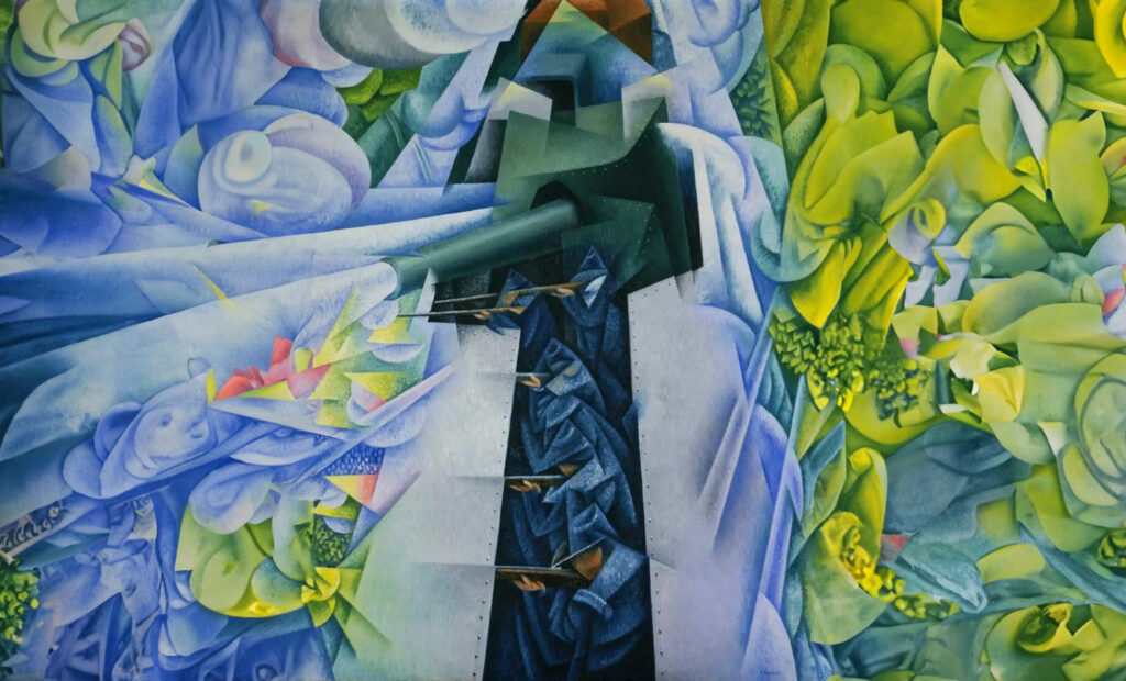
So, what’s different now? Fast forward to today, and the way we look at the future in art and design has chilled out quite a bit. It’s less about the roar of engines and more about sleek, sophisticated technology that integrates seamlessly into our lives—think more of a cool, silent electric car gliding down the road. The rapid evolution of technology, particularly digital technology, has transformed artistic mediums and methods. In the era of Futurism, technologies like the automobile and the airplane were new and represented raw power and speed, manifesting in art as intense, dynamic expressions. Today, technology is deeply integrated into everyday life and is often invisible—like AI, software, and nanotechnology—leading to art that reflects this subtlety and complexity rather than just power and speed.
As we consider these changes, today’s ideas about the future are more abstract, often losing the gritty connection with the real-world. We’re less about direct reflections and more about pondering “what ifs.” Do you remember the kid from ‘The Matrix’? Exactly. There is no spoon anymore. This change in perspective shows that our view of the future has evolved from a clear-cut extension of the present into a more nuanced, contemplative abstraction which is slowly losing its ground, moving toward a realm where the line between imagination and reality blurs intriguingly.
But why are we slowly losing our grip on reality? This is a topic ripe for other speculations.
Anatomy of a Couch
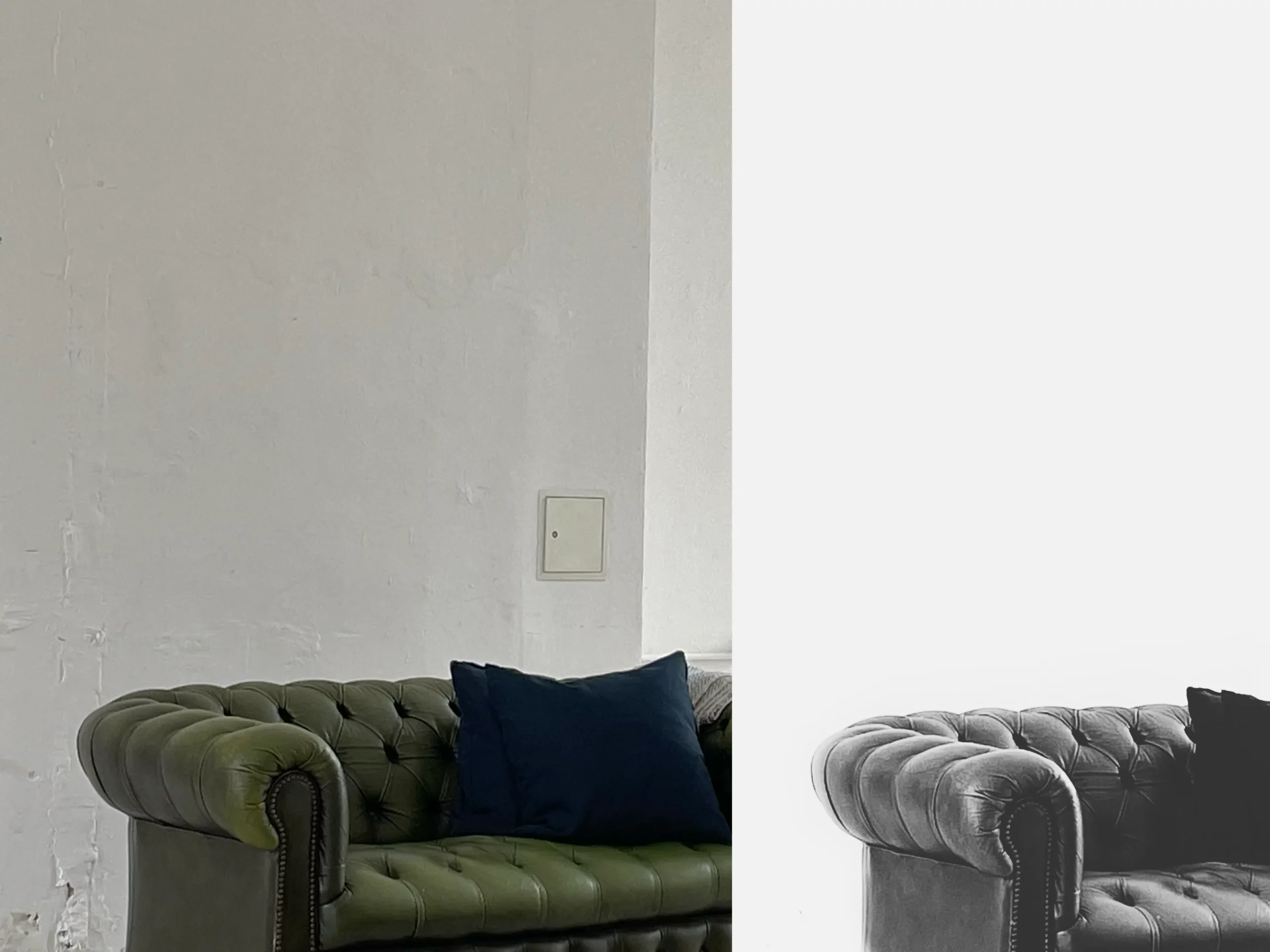
In friend’s photo studio, a lone green couch caught my eye, popping against the plain white walls like a doodle in a blank notebook. I snapped a photo with my phone from where I sat, too lazy to get up — it turns out, effort matters. The photo was meh, missing that special something I saw in it. Later, on the subway ride home, I thought, “Why not fix this?” So, I played around with the image in VSCO, trying to bring some life to this couch party. By the time I got off the train, the once boring image had transformed, turning into something worth a second look.
Remember how we wondered why we’re slowly losing our grip on reality in here? That thought hits home again as I look at the couch photo. That couch was just chilling there, and I wanted to make it something cooler than just a spot to sit. But what’s “cooler,” anyway? It’s those glossy, art-directed images that pop up everywhere, from billboards to film scenes, all designed to grab our attention and make things appear different than what they really are. We see these all the time, and slowly, they start to mess with what we think things are supposed to look like.
When I tweaked that couch photo on the subway, I wasn’t just sprucing it up — I was stacking up layers between you and the real deal. As Vilém Flusser puts it, these kinds of images aren’t just snapshots of the world; they’re “significant surfaces” that carry new meanings not found in ordinary objects or old-school texts. It’s not like the final shot was epic or anything, but that’s not really the point. It’s about the change, how we tweak and twist stuff until the jazzed-up version starts feeling more real than the original. It’s kind of wild how these glammed-up images start to stick in our brains as the new real.
I think it might help here if we break down the steps I took here. Let’s see how each layer I made gradually pulled us further from the reality step by step.
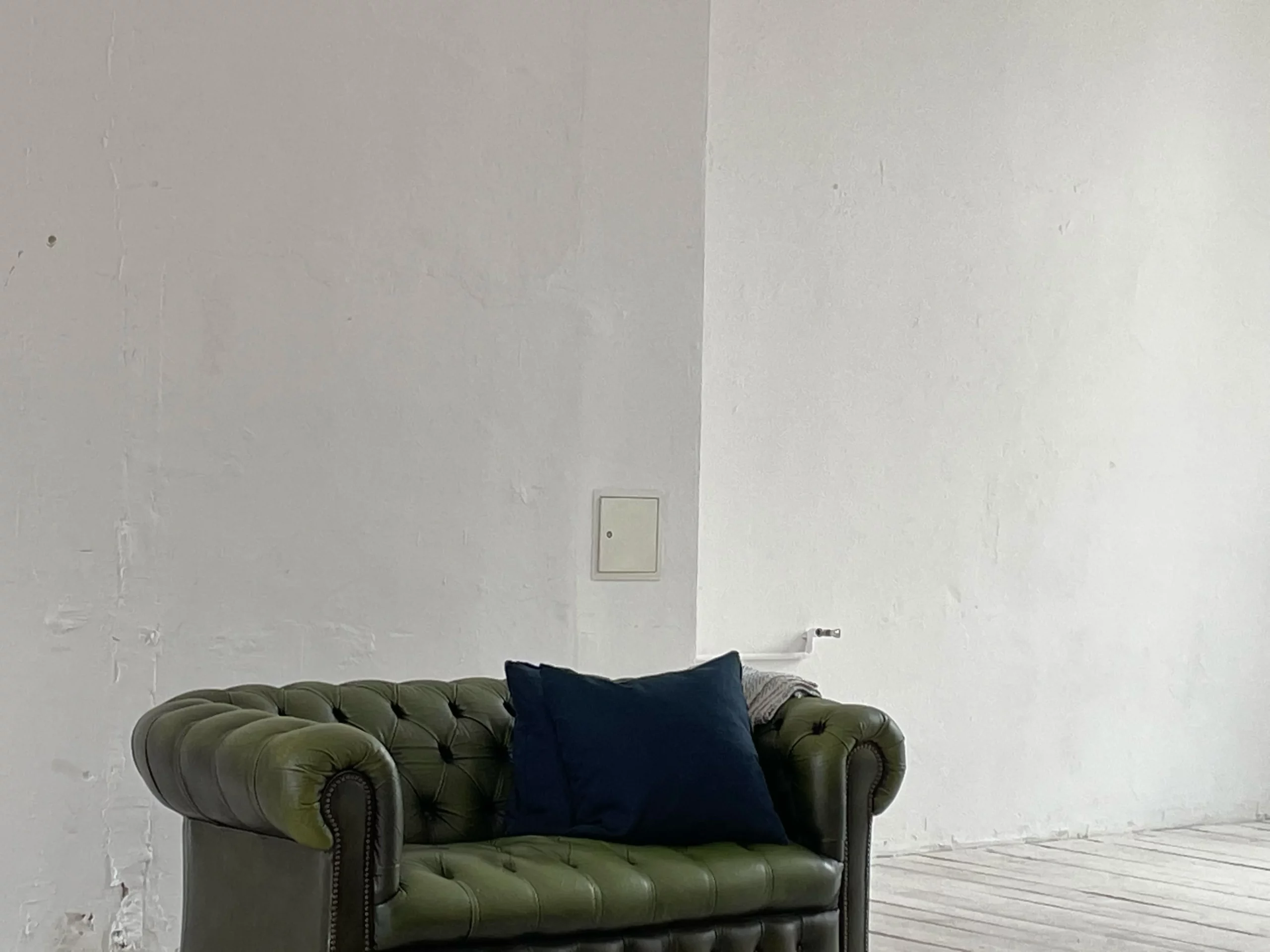
1. Dimensional Shift: Just by snapping that photo of the couch, we’ve already started messing with reality. See, taking a picture turns a 3D scene into a flat, 2D snapshot. This switch changes what information gets through to us, making us see things a bit differently than they are. Vilém Flusser talks about this stuff — it’s not just about what we edit later; the first twist happens the second we press that shutter.
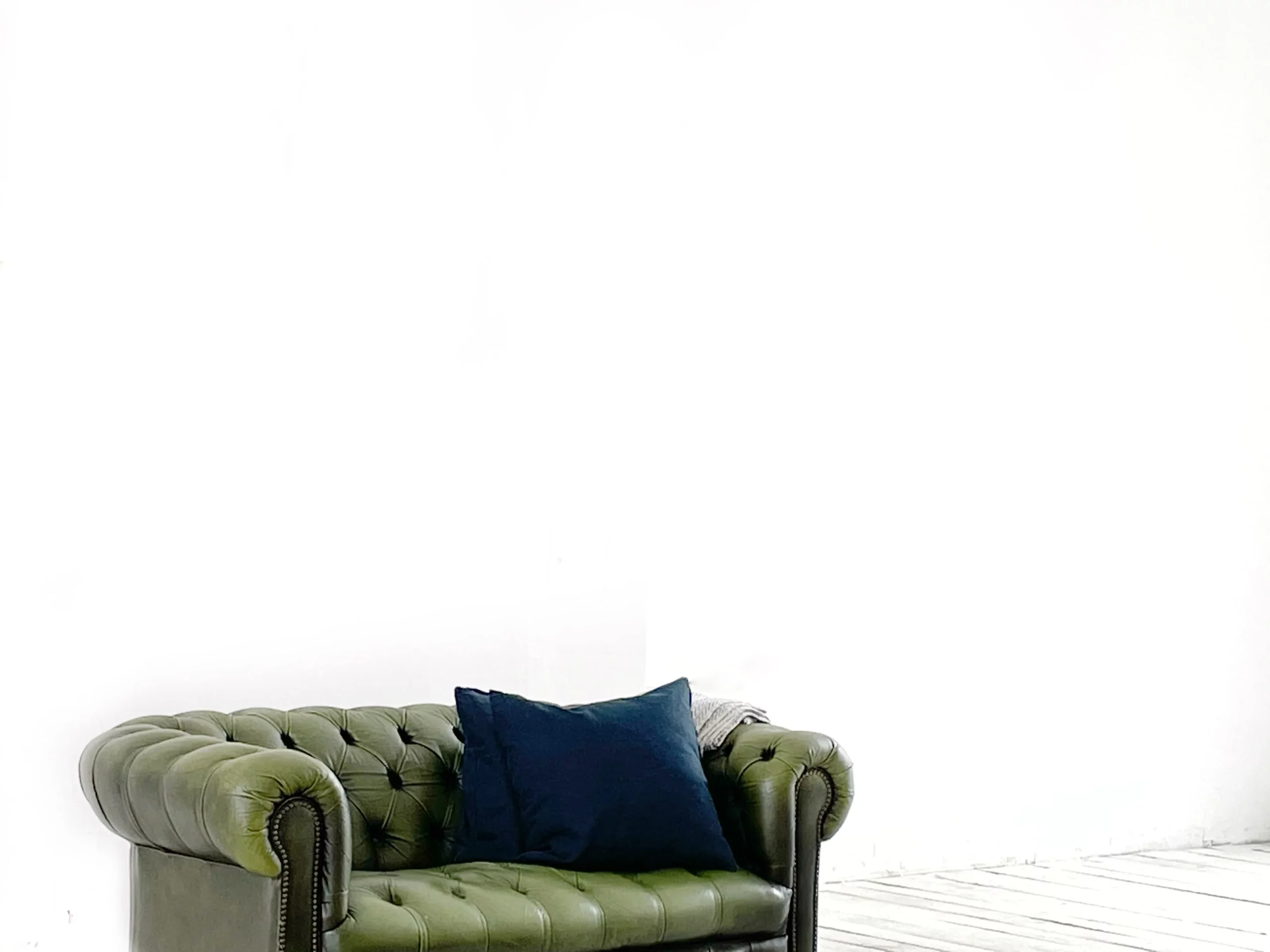
2. Brightening the Background: After the dimensional shift, I cranked up the brightness to nearly wash out everything but the couch. This editing move wasn’t just about spotlighting the main character — it also masked the unwanted, dirty details of the wall.
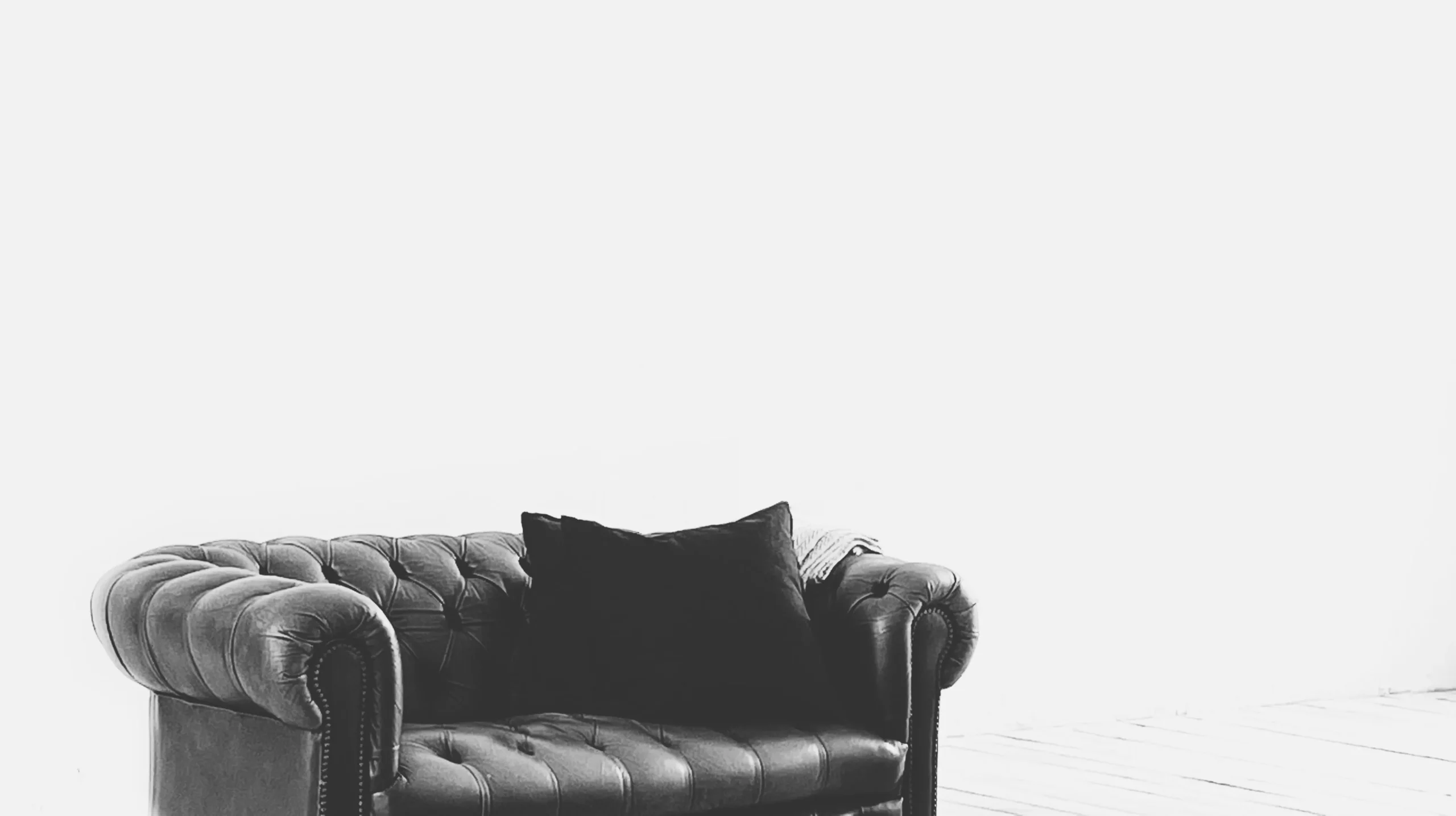
3. Contrast and Black & White: As the next layer in our image transformation, I ramped up the contrast to deepen the shadows and highlight the couch’s features. This wasn’t just about making the couch pop — it was also about creating an almost graphic quality that makes the image less about a real couch in a real room and more about an ideal or an abstraction of an ideal. Additionally, I converted the photo to black and white, which might seem like adding another layer between the viewer and reality. However, according to Vilém Flusser, this shift actually brings us closer to reality. Flusser argues that color in photography adds a superficial layer of interpretation that distances us from the true essence of the subject. By converting to black and white, we strip away this layer, reducing the world into a more direct, coded form of light and shadow. This abstraction heightens our perception of the essential forms, aligning with Flusser’s theory that technical images, by abstracting reality, can offer a deeper truth through their simplicity. It’s a bit like taking one step forward with the contrast, then two steps back with black and white — doing the reality tango, if you will.

4. Going Vertical and Cropping In: Final tweak? I turned the frame vertical and tightened up the crop. This was less about dramatic changes and more about refining the view. The couch now takes center stage not because it’s extraordinary, but because it’s been isolated from its mundane context. It’s like setting up a solo exhibit for an everyday object, making it stand out simply because we’ve chosen to focus on it.
After all the sliders adjusted and filters applied, what’s left? We’ve transformed a couch into something more than just fabric and frame — it’s now a symbol or an ideal. But let’s be real — this couch? It’s just one drop in the vast ocean of tweaked and polished images we dive into every day. If you think this one made you pause for a second, imagine the thousands, if not millions, of fabricated visuals you’ve encountered throughout your life. All these creations blur the line between the artificial and the real, reflecting how deeply synthetic our perceptions can become.
I want to finish here with lines from Radiohead’s “Fake Plastic Trees”
Her green plastic watering can
For her fake Chinese rubber plant
In the fake plastic earth
That she bought from a rubber man
In a town full of rubber plans
To get rid of itself
She lives with a broken man
A cracked polystyrene man
Who just crumbles and burns
He used to do surgery
For girls in the eighties
But gravity always wins
Maybe one day, I’ll even speculate on whether gravity really always wins.